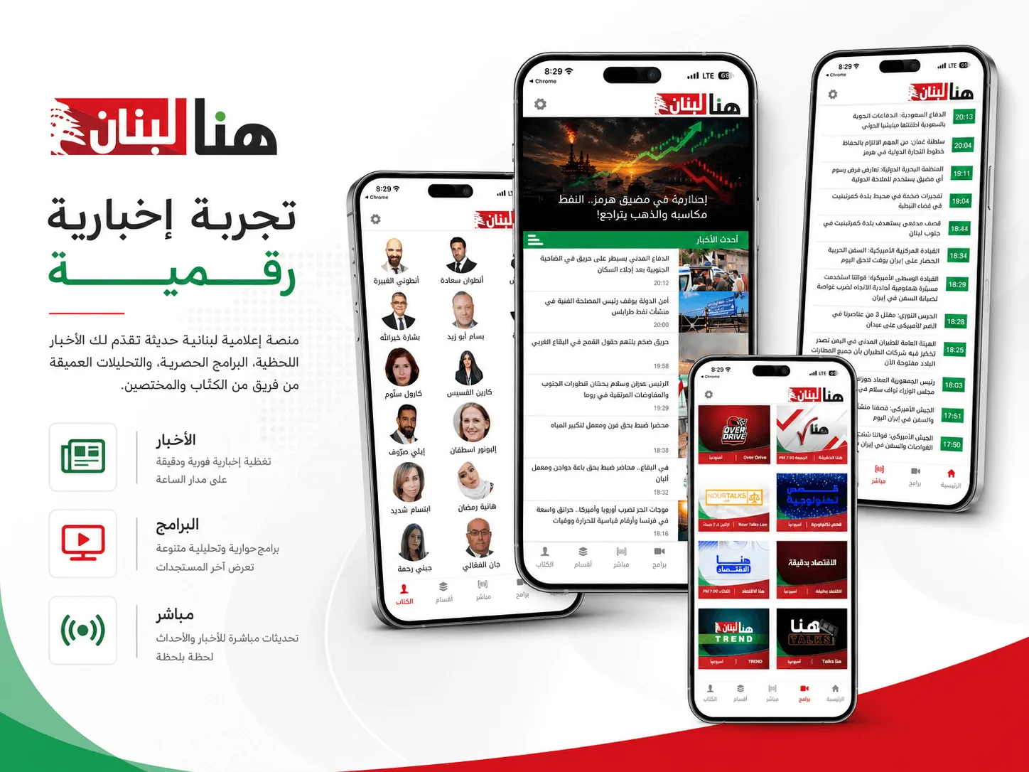
Hona TV
Live and recorded television on the web and on the phone, from one system. Broadcast interfaces are unforgiving: people arrive wanting one thing, and any friction between them and the play button is felt immediately.
Every design file is silent somewhere. The typeface has no weight that works at label size. Nobody drew the error state, the empty screen, or what a very long name does to a card. Somebody has to answer those questions, and if it is not the designer then it is a developer improvising, which is how what ships becomes a rougher cousin of what was approved.
Our designers sit in the same conversation as the developers, so those questions get answered while they are still cheap to answer. Everything gets drawn, including the states nobody enjoys drawing, and the person who drew it checks the built version against the file before anyone calls it done.

From the logo down to what happens when someone taps twice. Named by the file you receive, because that is what you are buying.
A logo drawn for your companyDrawn from scratch, with the variants a working company needs: horizontal, stacked, and the small square one for a profile picture.
Every format you will be asked forVector files that scale to a building, flat files for the web, dark and light versions, the favicon, and the app icon at the sizes the stores demand.
It still works small and in one colourTested at label size, in black on white, and stamped on something. Plenty of logos look good on a website and fall apart on a receipt.
Typefaces you are allowed to useChosen for how they read at the sizes you use most, with the licence checked, so nobody gets a letter about a font two years later.
Colour with exact valuesScreen values and print values, written down. A brand that is a slightly different red on the sign than on the site is the most common way this goes wrong.
The rules, written downSpacing around the mark, what not to do to it, and how the pieces work together. So whoever you hire next stays on brand without asking us.
Every screen drawnOn the phone and on the desktop, across the whole path a person takes, including the screens that never make it into a portfolio.
The states nobody enjoys drawingThe empty screen before there is data, the error that is not the user's fault, the loading moment, the form filled in wrongly, and the very long name in a small card. Everybody notices when these were skipped.
Something you can clickA prototype you and your team walk through before a developer starts. Changing a screen here costs a conversation.
The words on the buttonsLabels, empty-state text and error messages written as part of the design. Left to the end, they get written by whoever is closing the ticket.
Readable by everyoneContrast that passes, text that survives being enlarged, and targets big enough for a thumb.
Motion with a reasonMovement that shows where something came from or where it went. Tuned for a mid-range phone, and it steps aside for anyone who has asked their device to reduce motion.
The file is yoursThe working Figma, layers and components intact. It stays yours to take anywhere, including to somebody else.
A system your team can build onComponents, spacing, states and shared styles, so the next screen you need can be built without a designer redrawing it from scratch.
Assets already exportedIcons and images at the sizes and formats the build needs, named sensibly and ready to drop in.
Numbers a developer can readSizes, weights, spacing and colours taken straight off the file, so nothing has to be measured off a screenshot.
The questions answered before they are askedEvery file is silent somewhere. Ours says what happens at the widest screen, the smallest, and when the text is twice as long.
Checked against what got builtThe person who drew it compares the built screens to the file before anyone calls it done. This is where designs usually quietly become a rougher version of themselves.
Cards and stationeryBusiness cards, letterhead and the email signature, in files a printer accepts without sending them back.
Signs and vehiclesThe shopfront, the sign, the van. Drawn at the real size, because a logo behaves differently at three metres.
Packaging and printLabels, boxes, brochures and menus, set up with the bleed and the colour profile the printer needs.
Templates for socialLayouts your team fills in themselves, so weekly posts stay on brand without a designer each time.
A presentation your company can useA deck in your identity that somebody can put their own numbers into.
Photography directionWhat your pictures should look like, so the images on the site do not undo the identity around them.
This is the design work itself. If the design already exists and you only need people to build it, that is a development job: it is on the websites and mobile apps pages.
Two of ours where the interface was the product itself.
Live and recorded television on the web and on the phone, from one system. Broadcast interfaces are unforgiving: people arrive wanting one thing, and any friction between them and the play button is felt immediately.
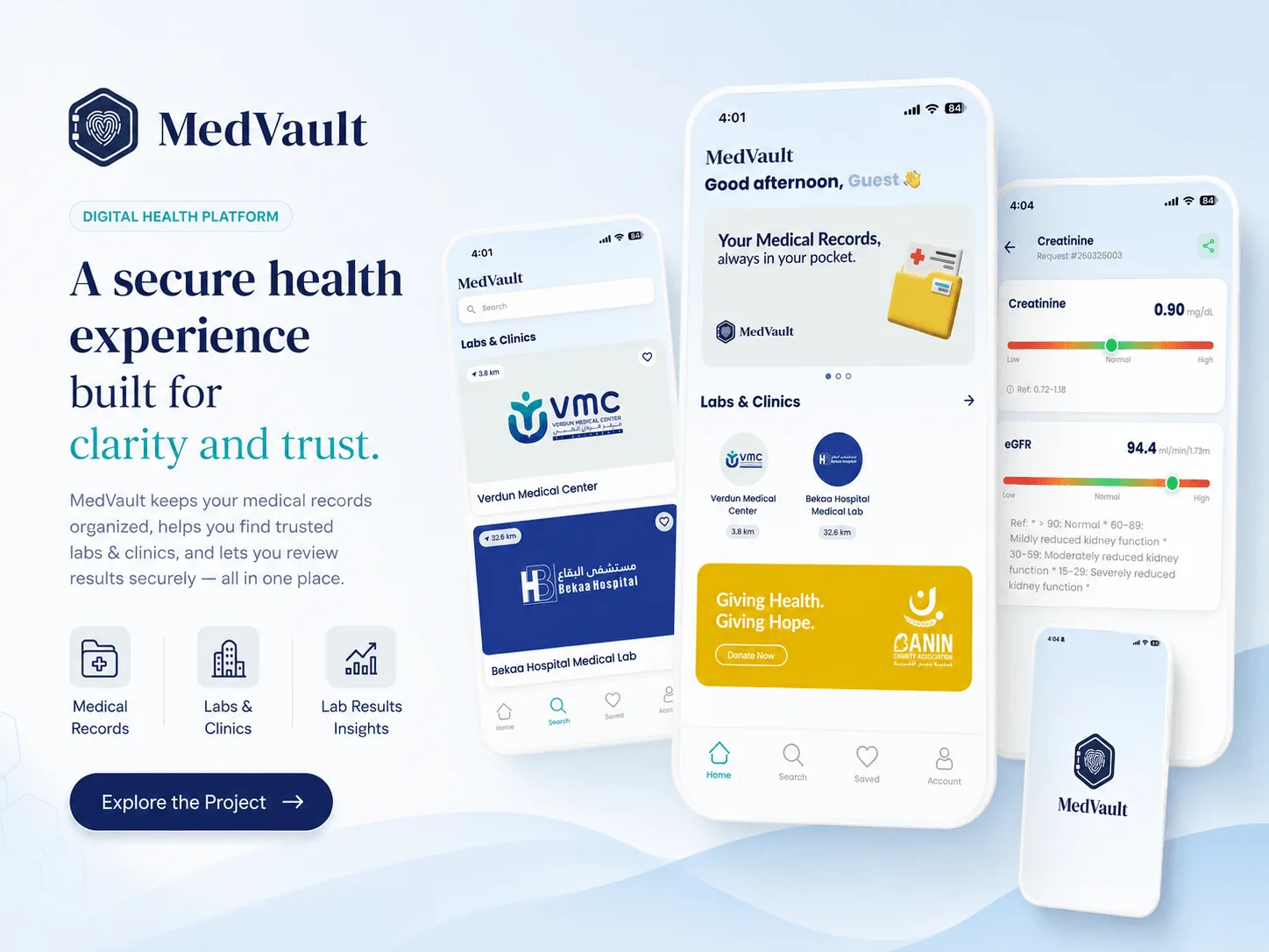
Medical results shown to people who are often anxious and not clinically trained. The design problem was calm: presenting a number that might be worrying without either hiding it or alarming someone unnecessarily.
Most projects need more than one of these. It is the same team whichever you add, so nothing gets handed between companies on the way.
Branding & design
Describe the goal. We will tell you what it takes and what you can skip.
Start a project→